
So graphic design is not your passion…
but you have to make a social post, a presentation, or maybe a marketing email. The truth is, almost everyone in a business setting will have to use design skills at some point, and this can be a challenge if you’re not a designer. Never fear, the basic rules of visual design are applicable to everyone and make a world of difference. Here are a few quick tips from the Esparza design team to make your designs look more professional.
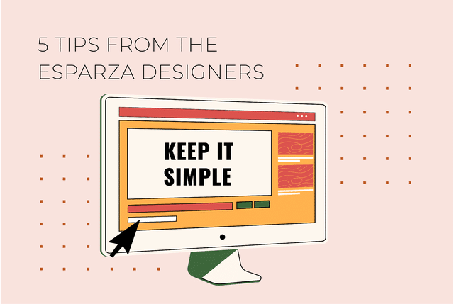
Tip #1: Keep It Simple
Your first instinct when it comes to design might be to go BIG — to make something elaborate with tons of color and nary a negative space. This is a mistake. Keep your designs simple by using limited text, fonts, shapes, and color choices. It’s easy to overwhelm a design with too many elements (all of the visual choices you make) like the busy example below:

This example uses too much text, and uses too many colors and different fonts. The result is overwhelming and difficult to read. Limiting your elements makes it easier to create a visual space that is balanced, clear, and aesthetically appealing.
Tip #2: Consider Visual Hierarchy
Visual hierarchy is a method of organizing design elements in order of importance. For example, people naturally notice elements that are large before small, bold before thin, close before far away, and bright before dull. Essentially, visual hierarchy is how designers direct a viewer’s eye and tell them what to pay attention to.
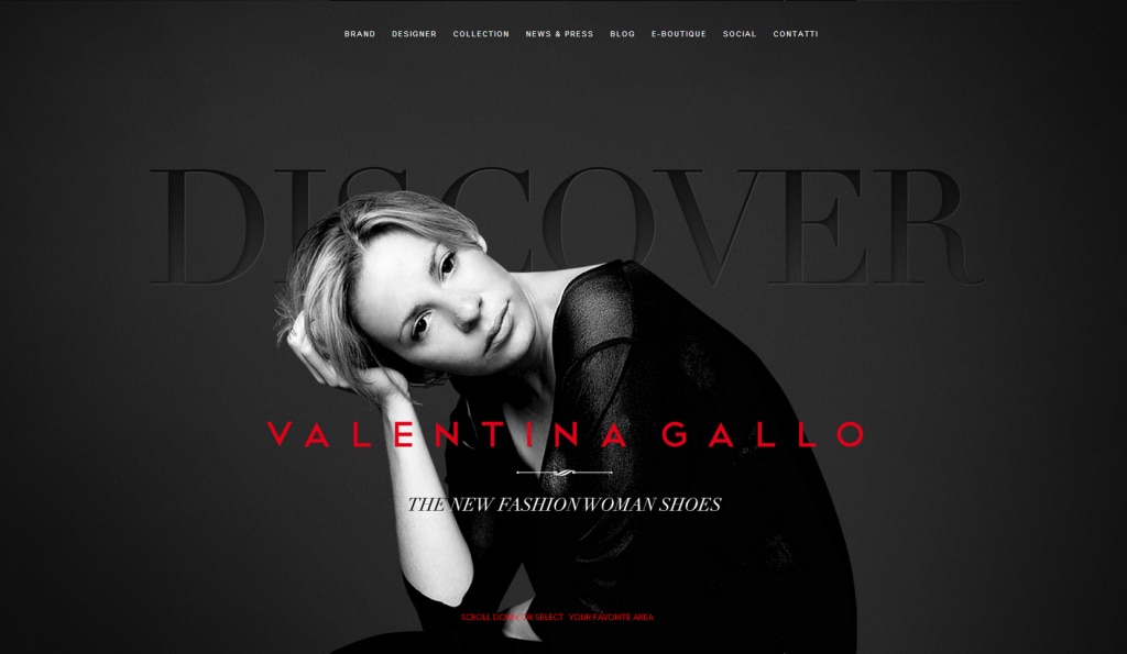
For example, the bright red lettering in this ad, as well as the woman’s brightly lit face contrasted against a dark background naturally draws our eye. Secondarily, we might notice the large ‘discover’ text. The small ‘the new fashion woman shoes’ copy isn’t as important as the ad’s call to action and central image, and its lesser importance is reflected in its small, thin text.
Consider what is most important to communicate in your design both in text and image and use the rules of visual hierarchy to emphasize that importance.
Tip #3: Choose High Contrast Colors
Choosing colors that look great together can be a challenge. But a good rule of thumb is to use high contrast colors: colors that are easily distinguishable from each other because of contrast in value or chroma. Keeping your colors high contrast makes your design more accessible. For example, white text set against a black background is much easier to read than navy blue text set against a black background. Good design communicates a clear message and you never want that message to be difficult to see.
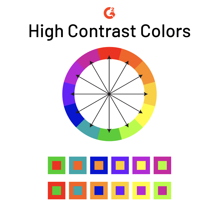
Some examples of high contrast combinations are: Black and white, red and blue, or yellow and purple, but you can also use this contrast checker: https://coolors.co/contrast-checker/5b2198-ffe920.
Tip #4: Give it Space
Negative space is space that isn’t actively being taken up by an element like text or an image (think of the solid color fill or white space that makes up the background of your design). Beginning designers often want to fill up every inch of negative space, but this often leads to design that is crowded and confusing. Negative space is an element in and of itself, one that needs to be considered in all design.
Consider how negative space is used in this example to create two separate forms (the bear and the girl’s hair).
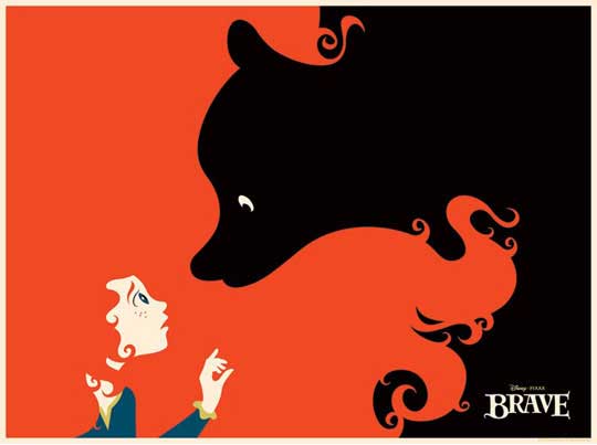
If the girl’s hair or bear’s fur was more detailed and rendered, it would actually pull attention away from important pockets of information (the girl’s face, the bear’s eye, and the Brave logo). Keeping the balance between negative and active space is another way to balance your piece and direct a viewer’s eye.
Always pay attention to your negative space, and how much space your elements should actually take up to create emphasis or harmony with the surrounding spaces.
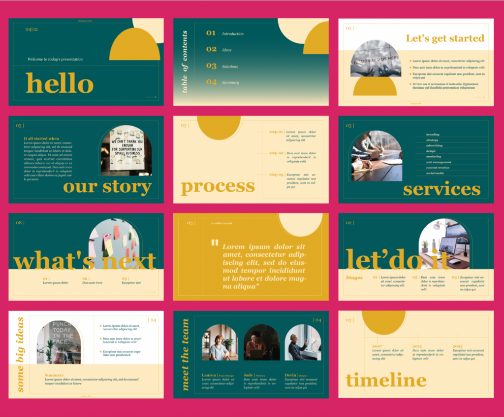
Tip #5: Use Professional Templates
Professionally made templates can save you a ton of time and anguish if you’re not a designer. Check out these Esparza-made presentation templates! They’re free to download and easy to use.
As you can see, graphic design can take a lifetime to master, but using these rules can make a world of difference.