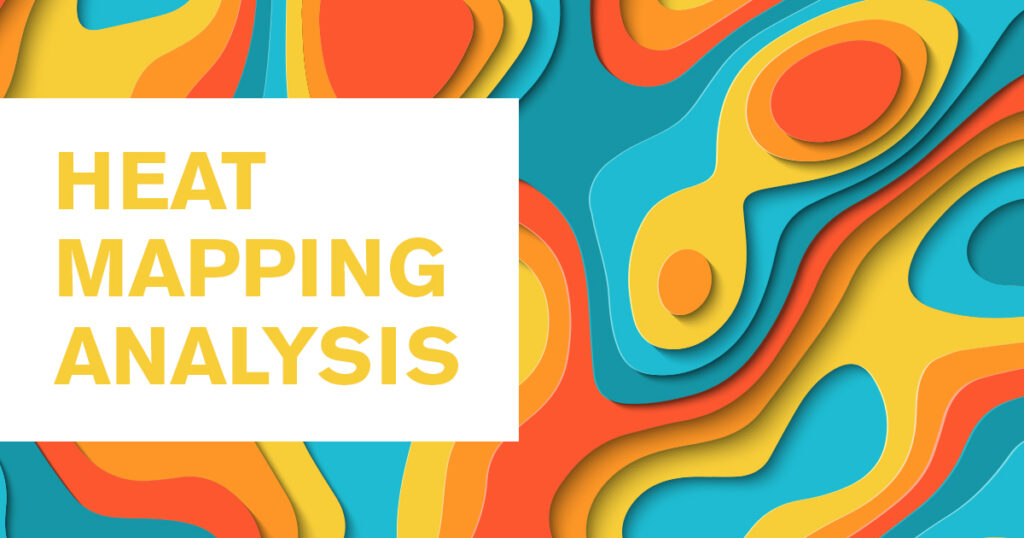
Website optimization and research helps you and your business’ website host a smooth and efficient user experience. A great way to do this is through heat mapping. Heat mapping is a portrayal of visual data; think of data (graphs, pie charts, etc) meets Predator, yes it’s that cool.
This allows you to actually see how users are viewing the site. You can see pages they visit, how much they scroll, links they click on or phrases people try to click on that they think is a link yes, this has happened before) and more.
How it works:
The heatmap tool will monitor where the mouse goes and leave a mark. The more people click on a link or scroll, the brighter of a mark it will leave.
How to read it:
By the use of colors, you are able to see where people go. The brighter the color, that means more people are in the area. Darker colors signify less use.
What this means:
By knowing what pages and areas people are interested in, you can enhance upon the areas that need more attention or make the interested pages more prominent.
Scrolling data:
- You can see what pages people scroll on, how much they scroll, where they stop to read and how far they go. The pattern the map leaves is pretty easy to follow. If you notice as the page goes on that the percentage decreases, hat means people are stopping to scroll at some point and leaving the page. You can try to add a hook or something to help keep the onlooker engaged.
- The darker colors with high percentage means that people are scrolling to that point to stop and read the content. You know that people are interested in the information and spending some time there.
Click data:
- It is important to see what pages people click on, it shows interest. You’ll want to make sure that page is up to date, intriguing to keep them there, and easy to navigate. Providing information that people want is key, that’s why they’re there! That takes us to the next point:
- Sometimes you will notice a significant amount of people click on an area that they think is a link but is not. This can help you understand what people what to know. If the information is not there, you know what you need to add that you may have not thought of initially.
Tips: Here are some tips to help optimize from analysis.
- Short time spent on the site: This could mean that people are scanning the site, it’s what most people do when browsing a website. Images, concise sentences, easy formatting such as bullet points and bolding can help people spend a little bit more time there absorbing information easier.
- Images: As shown in the example below, people love a good image and will try to click on it. Images help peak interest which is a great thing for people staying to look at the content, by providing additional information along with an image, it keeps people interested for longer.
- Fold: Be aware of where the fold is on a page. This means anything under where the bottom of the screen stops, the fold, a user will have to keep scrolling for more information. It is good to have pertinent information above the fold for ease, but also make it apparent that there is more good stuff if people keep going.
People were interested in these icons. By the 81% you can see that users stopped here to see these images. The little yellow dot means that lots of people tried clicking on that specific graphic. It was not a link! We now know that these probably look like clickable images and that people want more information. We are now working to supply this to them.
Some interest in events which is good! We know to keep this up to date and that it is being used.Not a lot of people made it to the end of the page, but we are able to see where they wanted to go after they read through this page.